Updated: December 16, 2025
Nature’s first green is gold,
Her hardest hue to hold.
Her early leaf’s a flower;
But only so an hour.
Then leaf subsides to leaf.
So Eden sank to grief,
So dawn goes down to day.
Nothing gold can stay.
Read everyday.
Spend time with nature.
Ask questions.
Never stop learning.
Don't pay attention to what others think of you.
Do what interests you the most.
Study hard.
Teach others what you know.
Make mistakes and learn.
It's okay to not know things.
I thought I was writing what I wanted to read. That's what I would think when I didn't know how to phrase something or end a story. I'll just remind myself: I'm writing what I want to read.
Every puzzle is solved by shifting your perspective.
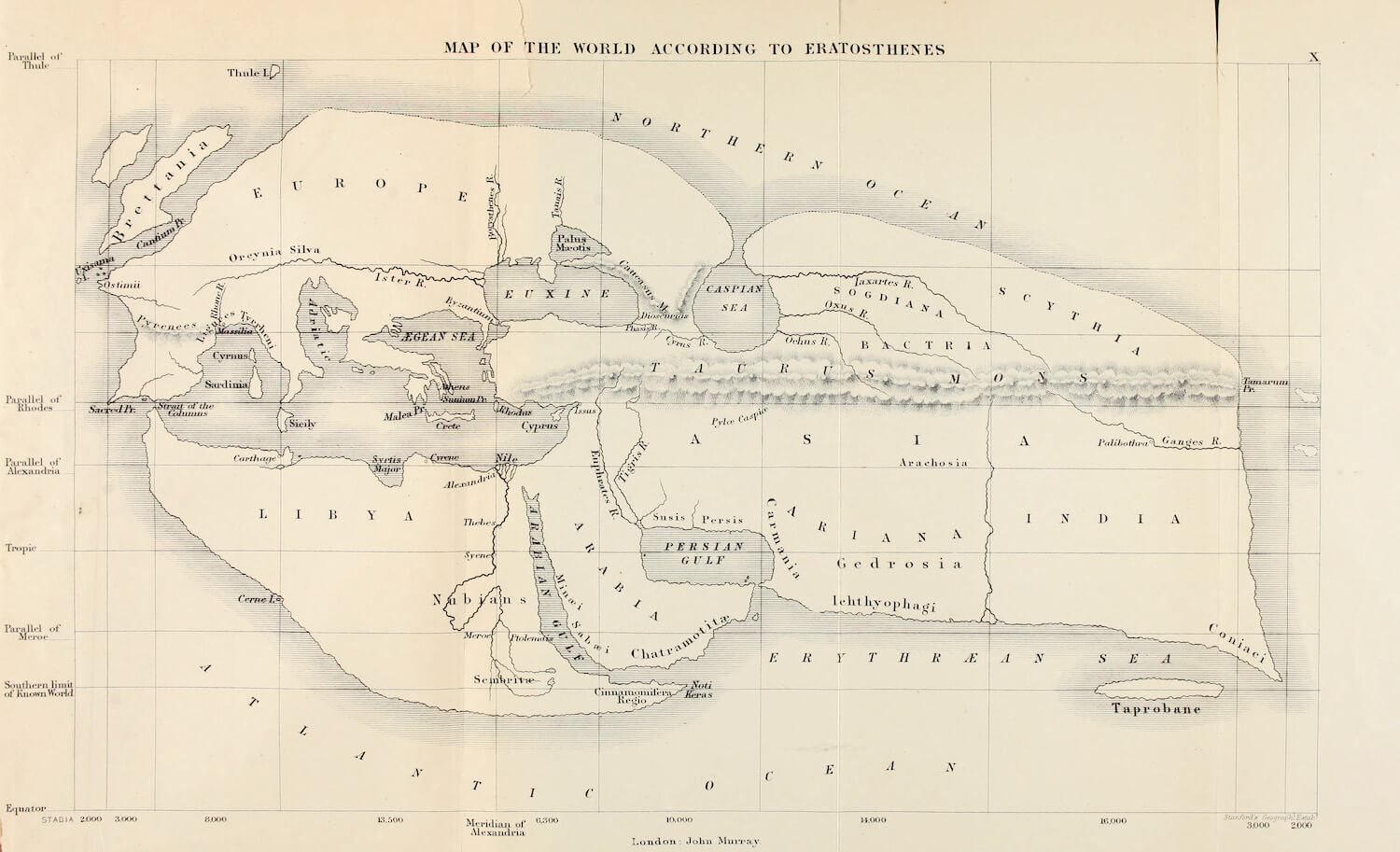
A map is not the territory it represents, but, if correct, it has a similar structure to the territory, which accounts for its usefulness.
Acquisition: Drawing form is impossible without first seeing form. Hand ability shortly follows eye ability.
Krashen - Acquisition begets speaking.
Gammell - Seeing is seeing relationally.
more complexity (the ensemble?)
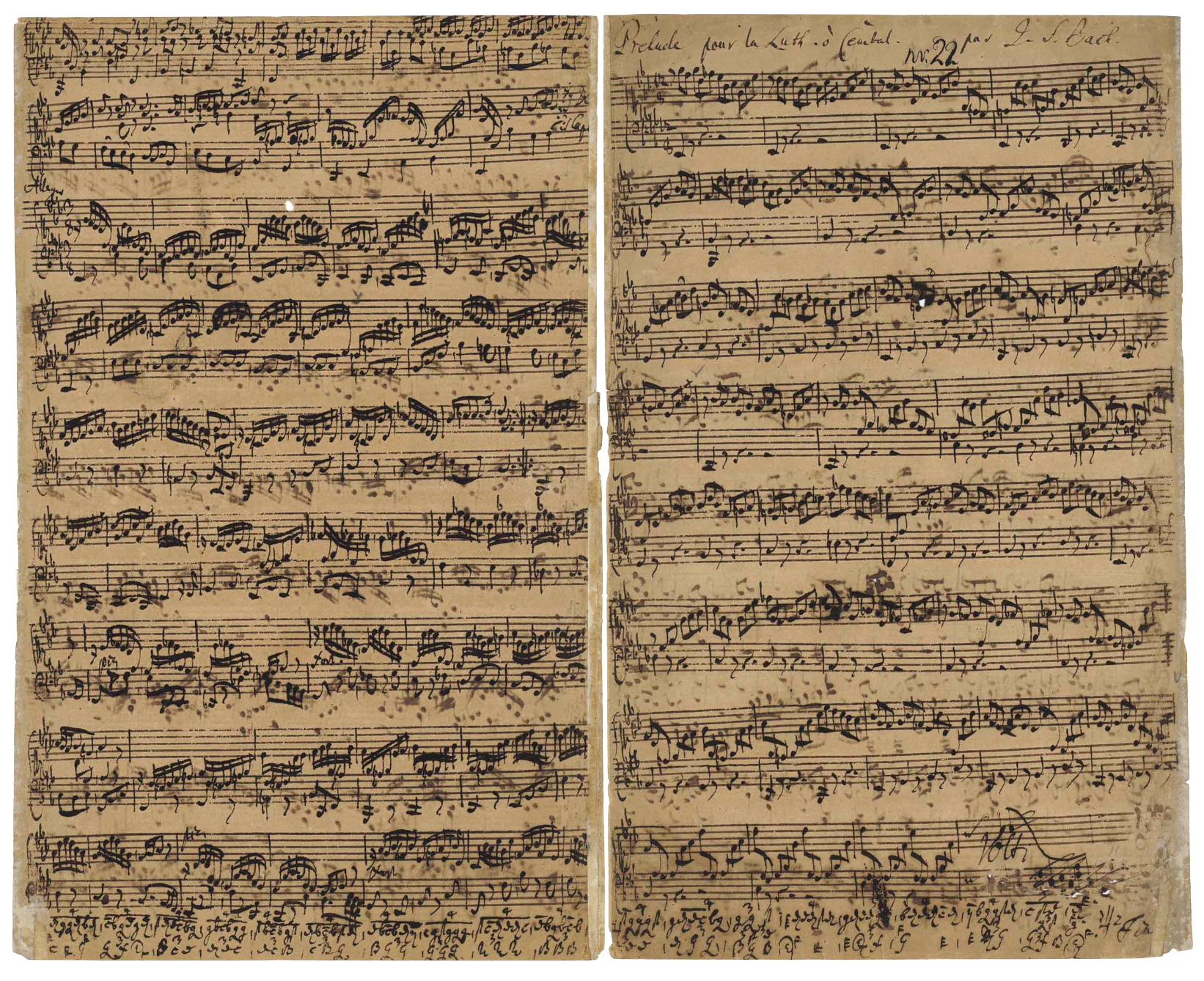
The skills that are a result of discipline and repetition. Muscle memory. Practices that can be acquired immediately upon learning of it.
todo: add section here on memory drawing greek vases.
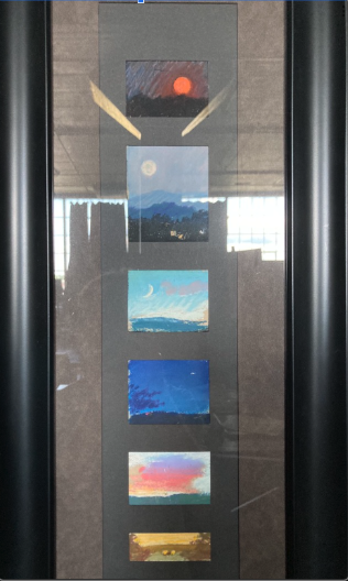
Terracotta stamnos (jar) Attributed to the Menelaos Painter
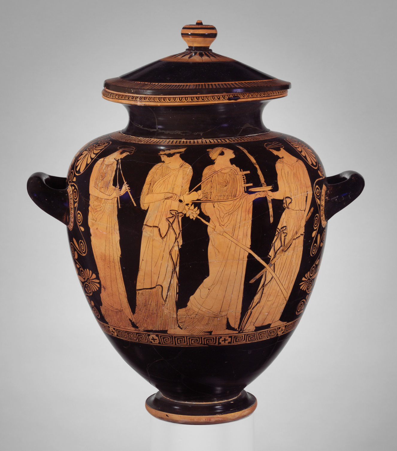
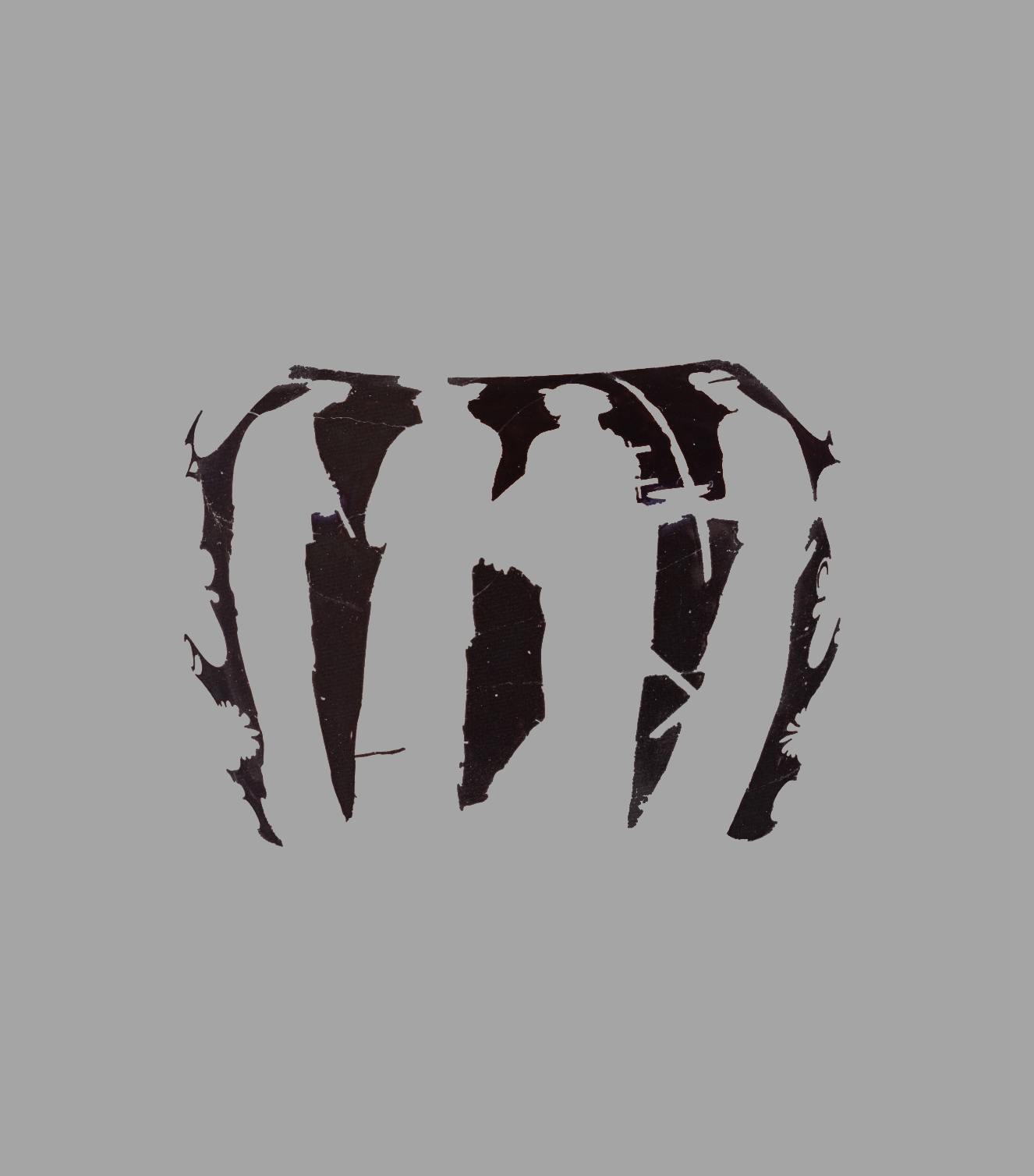
Pattern must be infinite... but maybe there are just a few essential types like the main line?
Can there be a pattern of strong-weak in the main line and counter line? For example, every other counter line is "strong" (contrast, effect, extent) vs weaker, less defined or prominent lines. music: crescendo, steady beat
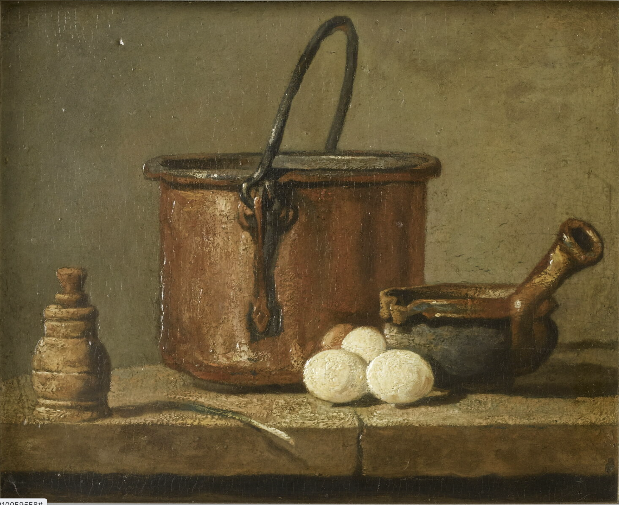
Chardin, Ustensiles de cuisine, chaudron, poêlon et oeufs
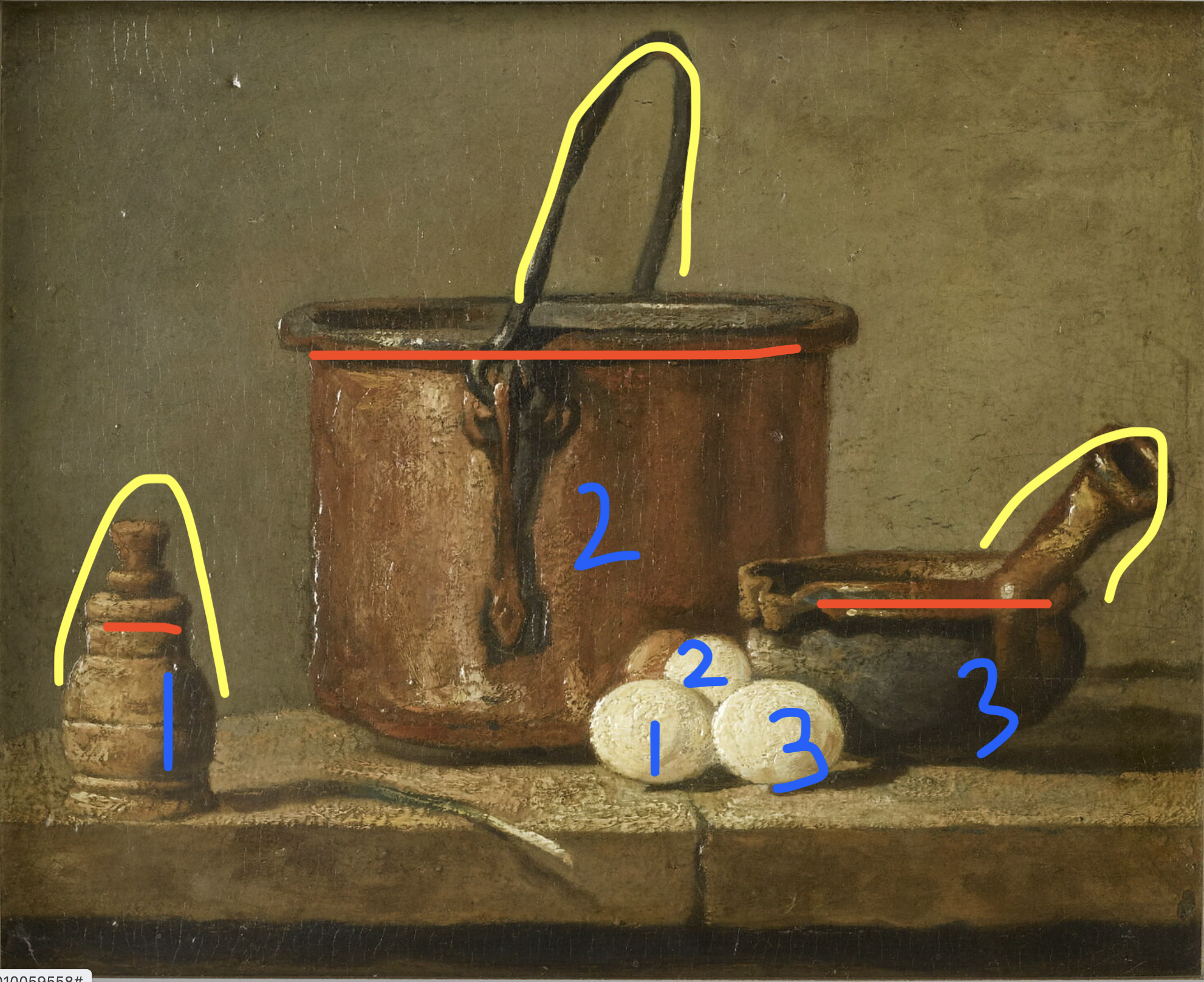
Are there essential types of correlations? Maybe it's just the elements of Color and Drawing lists? Or is object-minded thinking part of correlations? Material, object, use, cultural associations
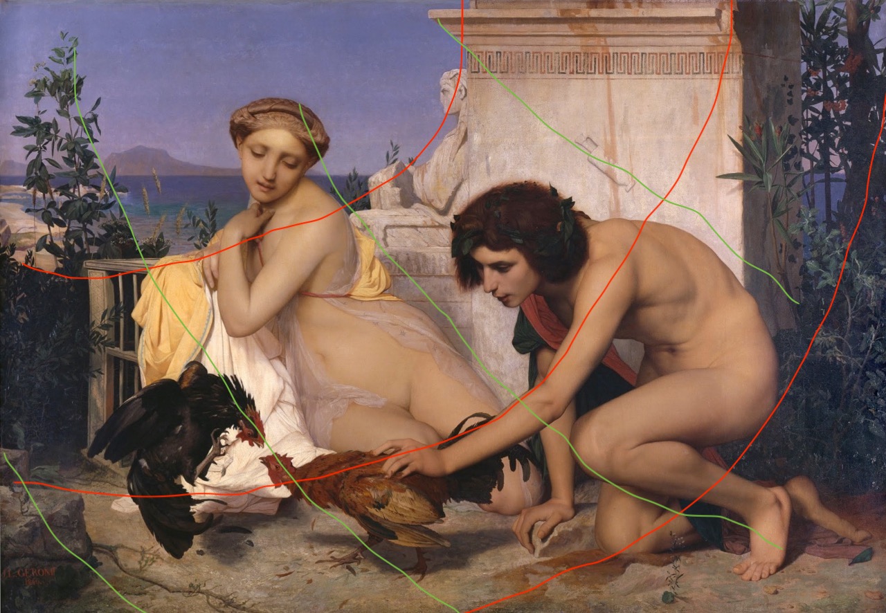
Distribution of Effects
Recurrence and differentiation
Featuring
Color Scheme
Dominant Color (eg, A Red Picture)
The Reds, The Blues, The Yellows, The Lights, The Darks
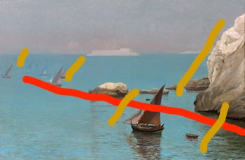
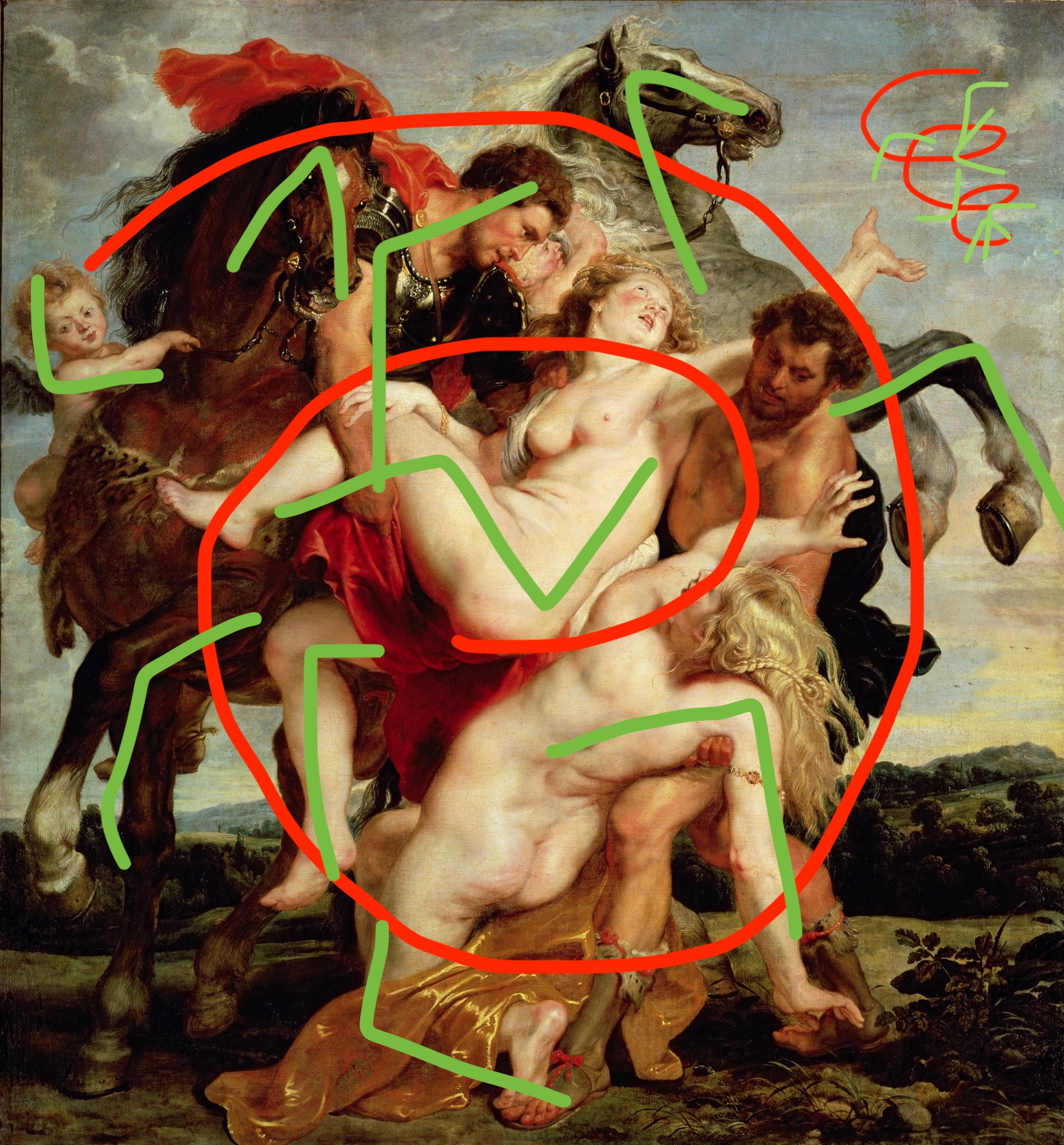
Things to work out more before officially adding:
Not sure how to think about this list. These are values I think worth considering, but they seem to be the result of mastery rather than a skill in themselves. What is Beauty?
Linseed oil, palette knife, round hog hair brushes with long bristles, rags
Beyond my knowledge but something to note: lots to learn on pigments, and paints of the same pigment can be made differently. Interact with oil differently, and in combination with other pigments, and how they are used. For example, Ralph Mayer's 3rd edition has a comment on Ivory Black causing cracks if used as an underpainting, 5th edition has absorption spectrum charts of different pigments.
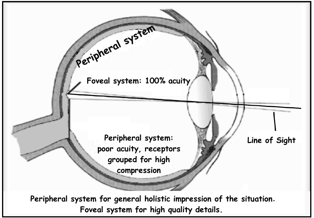
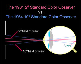
Due to the distribution of cones in the eye, the tristimulus values depend on the observer's field of view. To eliminate this variable, the CIE defined a color-mapping function called the standard (colorimetric) observer, to represent an average human's chromatic response within a 2° arc inside the fovea. This angle was chosen owing to the belief that the color-sensitive cones resided within a 2° arc of the fovea. Thus the CIE 1931 Standard Observer function is also known as the CIE 1931 2° Standard Observer. A more modern but less-used alternative is the CIE 1964 10° Standard Observer, which is derived from the work of Stiles and Burch,[9] and Speranskaya.[10]
For the 10° experiments, the observers were instructed to ignore the central 2° spot. The 1964 Supplementary Standard Observer function is recommended when dealing with more than about a 4° field of view. Both standard observer functions are discretized at 5 nm wavelength intervals from 380 nm to 780 nm and distributed by the CIE.[11] All corresponding values have been calculated from experimentally obtained data using interpolation. The standard observer is characterized by three color matching functions.
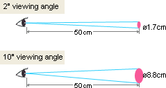
the 10° and the 2° angles refer to the field of view when physically viewing a sample. The field of view subtends either a 2° or a 10° angle on the retina.
A better way to understand this is that a 2° field of view is equivalent to viewing a 1.7cm circle at a distance of 50cm; a 10° field of view is equivalent to viewing an 8.8cm circle at a distance of 50cm.
So roughly, the 2° field of view is equivalent to viewing a 1.7cm circle at a distance of 50cm; or like looking at your thumbnail at arms length away and the 10° field of view is like looking at the palm of your hand (or a three-inch circle) at arms' length.
embed lindesay harkness article on seeing values
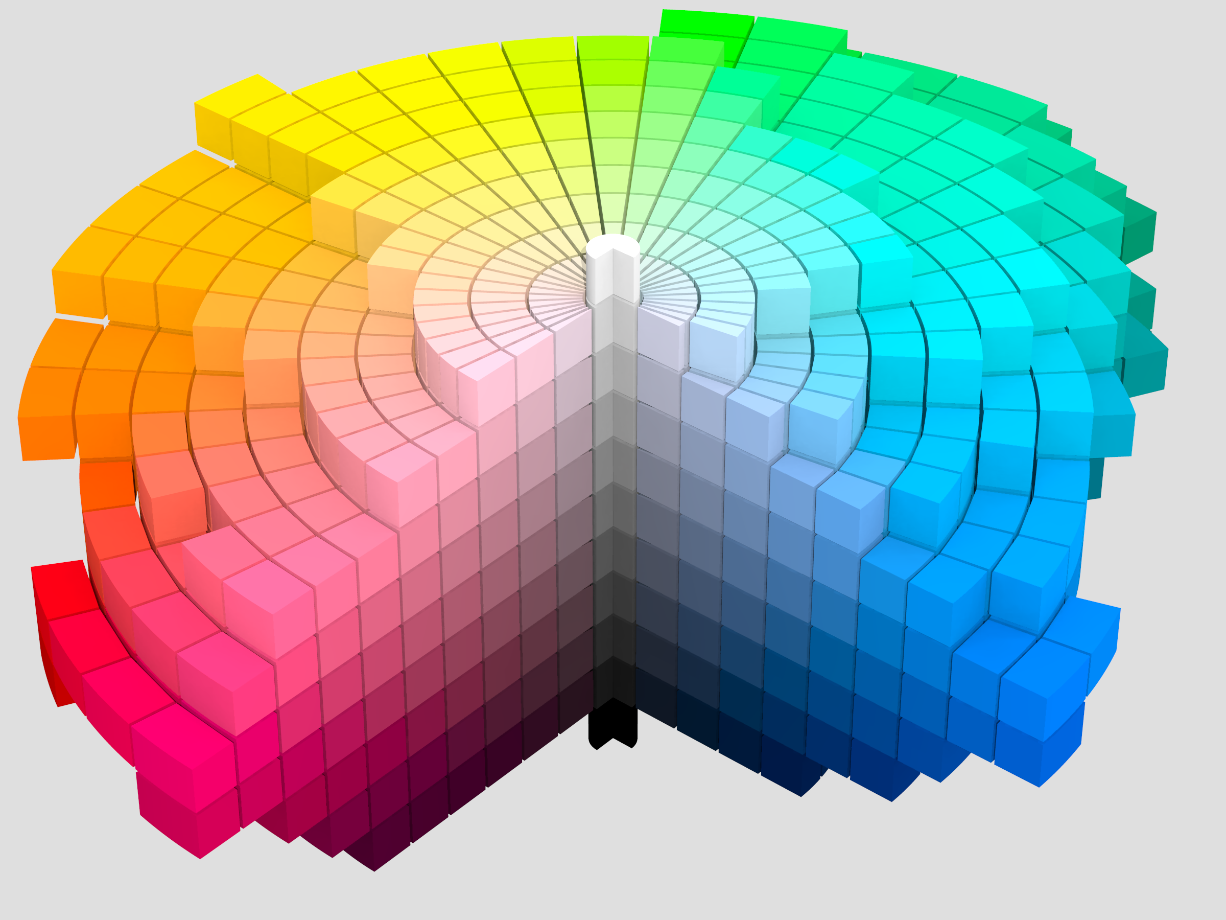
Munsell determined the spacing of colors along these dimensions by taking measurements of human visual responses. In each dimension, Munsell colors are as close to perceptually uniform as he could make them, which makes the resulting shape quite irregular. As Munsell explains:
Desire to fit a chosen contour, such as the pyramid, cone, cylinder or cube, coupled with a lack of proper tests, has led to many distorted statements of color relations, and it becomes evident, when physical measurement of pigment values and chromas is studied, that no regular contour will serve. — Albert H. Munsell, “A Pigment Color System and Notation”
Chroma, measured radially from the center of each slice, represents the “purity” of a color (related to saturation), with lower chroma being less pure (more washed out, as in pastels).[6] Note that there is no intrinsic upper limit to chroma. Different areas of the color space have different maximal chroma coordinates. For instance light yellow colors have considerably more potential chroma than light purples, due to the nature of the eye and the physics of color stimuli. This led to a wide range of possible chroma levels—up to the high 30s for some hue–value combinations (though it is difficult or impossible to make physical objects in colors of such high chromas, and they cannot be reproduced on current computer displays). Vivid solid colors are in the range of approximately 8.
